Werkmmaat–Branding & brand architecture

Werkmmaat is a socio-economic non-profit organization dedicated to helping individuals with significant barriers to employment. They offer a combination of job placement and personalized support to help participants move into the regular job market.
In 2018, KAN created a brand strategy for Werkmmaat, which was the start of a successful partnership. Subsequently, we had the chance to handle the branding and website development for many of their sub-brands, providing each with a distinct identity and graphic design.
A selection of our projects

De Ruien
The Ruien are the underground canal network beneath the city of Antwerp. Werkmmaat engaged us to develop a new website that was easier to navigate, thanks to a refined information architecture. Additionally, we revised the graphic style, signage, and brochures, focusing on a broader European audience.
The old website was a barrier for both staff and visitors. The result was a revamped website that received the prestigious 'Awwwards Honorable Mention' in 2023. The website was praised for its user-friendliness, content, creativity, and design, and is now accessible to everyone, including people with visual and motor impairments.

Vertelfestival
For the very first edition of the Vertelfestival in Lier, we provided the branding and promotional material for this cultural event. The festival included an afternoon of stories, theater, performances and workshops, plus a pop-up library and other surprises. We created a creative and playful brand identity that perfectly captured the essence of the festival — promoting storytelling to young audiences. Our branding came to life in posters, program brochures and a social media campaign, helping to bring attention to the event both locally and online.
City Camping Antwerp
City Camping Antwerp marked a new beginning for the Antwerp city campsite. With Werkmmaat as the new operator, a rebranding of this unique location was on the agenda. We assisted them in developing a stylish visual identity, printed materials, and a website. The logo and branding highlight the view from the campsite, with the stunning Antwerp skyline taking center stage. To make the stay even more memorable, we also designed on-site communication materials, including signage, banners, and a brochure showcasing the highlights of Antwerp.
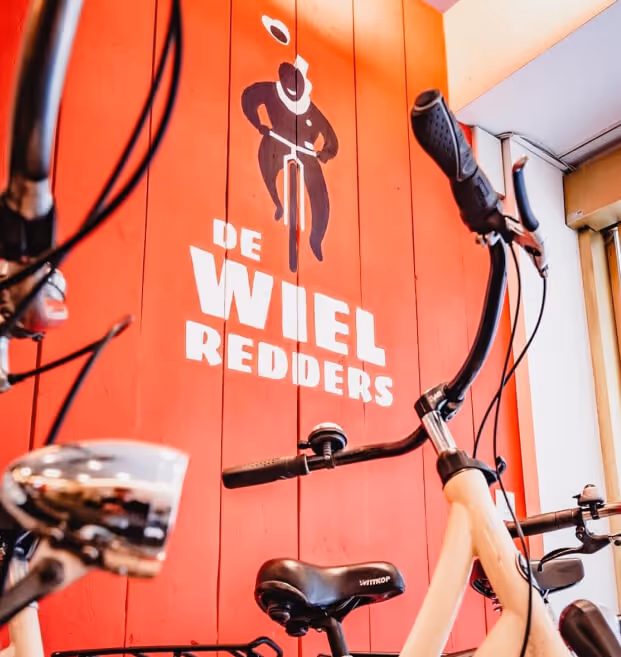
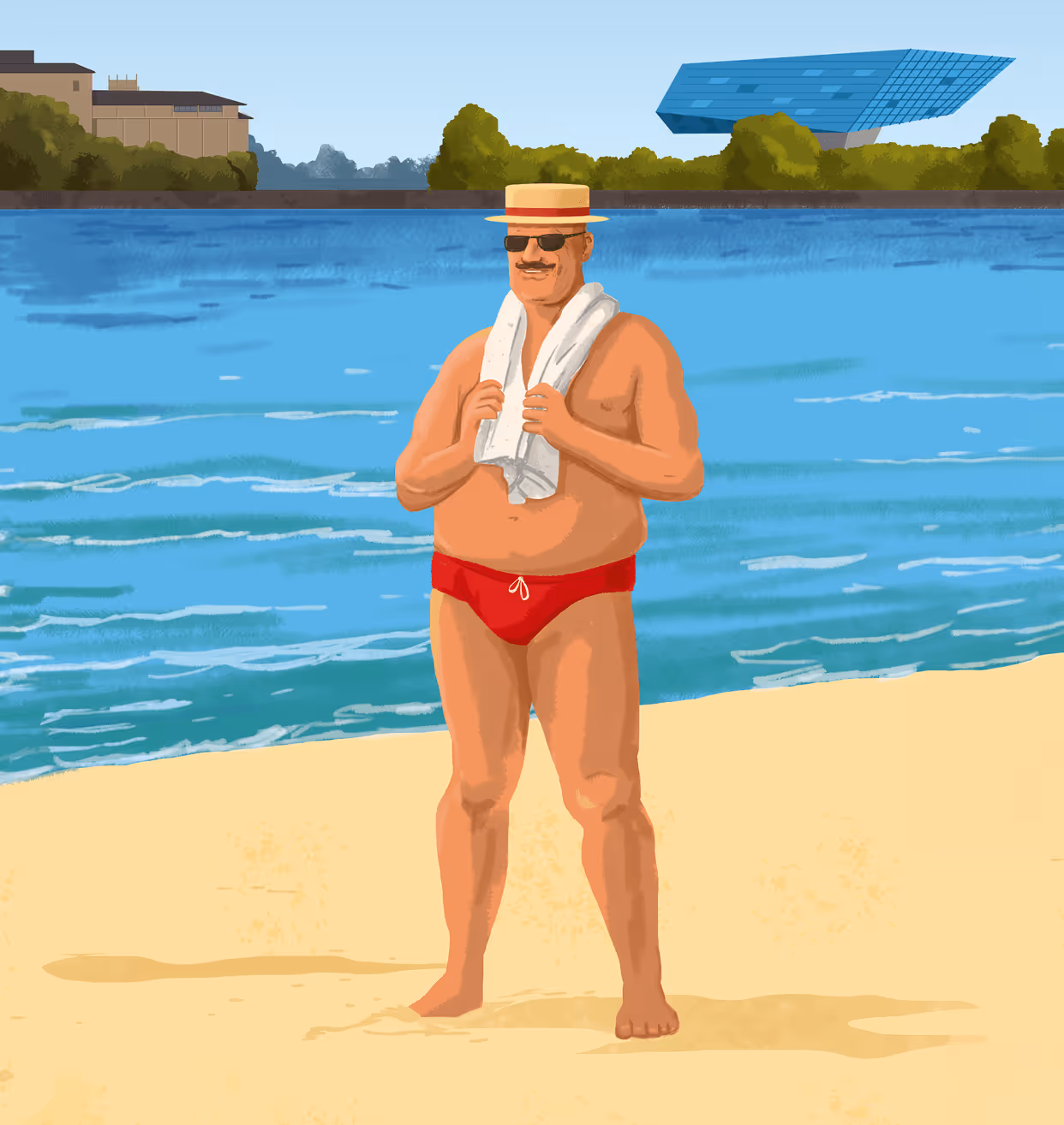
De Wielredders
In 2021, Werkmmaat introduced the bike shop 'De Wielredders'. From the start, KAN was given the opportunity to execute a complete branding project. Our goal was clear: to develop a brand that appeals to students and reflects Werkmmaat’s accessible DNA.
We came up with the name, designed the logo, created a low-budget website, and developed the interior of the bike shop. Even painting the logo on the wall was part of our responsibility.


.avif)

Thank you!
We received your form and will be in touch soon!
Have a look at our work in the meantime.