IDEWE–Branding & visual identity
IDEWE is a Belgian company that focuses on prevention and protection in the workplace. They offer companies comprehensive support to ensure safe and healthy working environments, with a focus on occupational safety, health care, psychosocial well-being and ergonomics. Idewe's expertise and commitment to wellbeing are at the core of their services and brand identity.
A selection of our projects

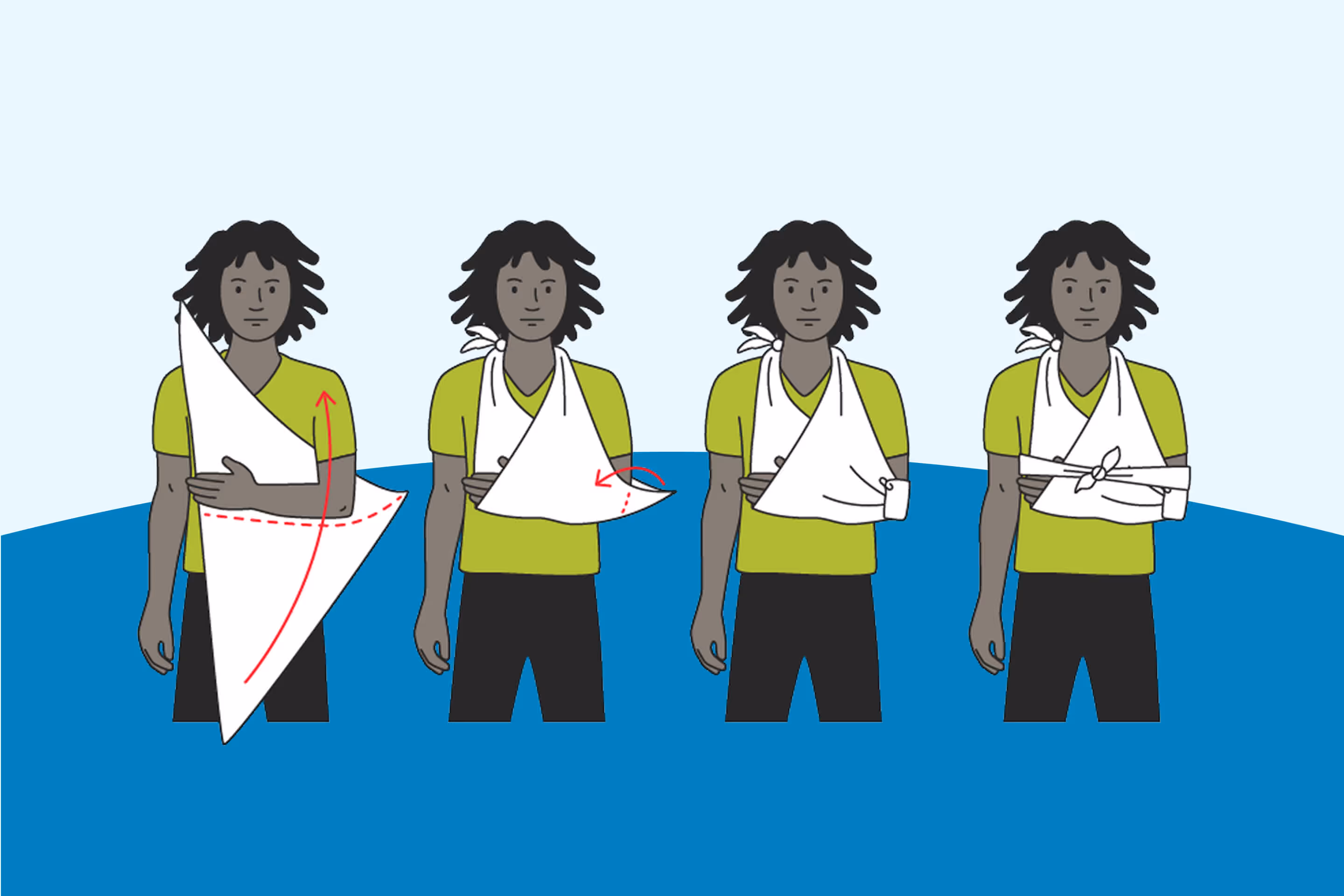
Illustrations
To give IDEWE’s branding a more human touch, we created a distinctive illustration style. This style is applied in different formats: digitally, in animations, on posters, and in training materials. The illustrations help create a warm and approachable brand identity, making IDEWE’s various applications even more effective.

Brand architecture
A few years ago, IDEWE’s visual identity underwent a thorough update aimed at preparing the branding for future applications and making it more versatile across various digital media. The existing logo was refreshed in terms of shape, color, and typography. To maintain visual consistency across different digital applications, we created an extensive digital brand guide. This guide supports developers in integrating the IDEWE brand into digital applications.
Creative Connect Centre
Creative Connect Centre, a sub-brand of IDEWE, focuses on translating complex welfare issues into customized solutions. For Creative Connect Centre, we developed a new visual identity, including a logo, icons and various applications for both digital and print media. This renewed branding provides a uniform and recognisable appearance that matches IDEWE's core values and reflects the essence of the sub-brand.


.avif)


Thank you!
We received your form and will be in touch soon!
Have a look at our work in the meantime.